Your homepage is your internet storefront. You only have a few seconds (no more than 5, actually) to impress your visitors and keep them from bouncing away.
From a digital marketing standpoint, your homepage is one of the most important elements. You have to strategize it, polish it and kep it updated. In other words, your homepage has to be perfect.
Let’s have a closer look at some great home pages and take them apart to understand how they work.
1. Logo
Of course, the first thing you want on your homepage is your logo. It’s usually in the top left corner of the page–this is where people expect to see it.
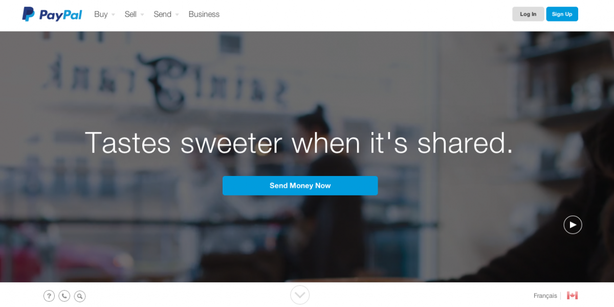
I’m a total fan of the new Paypal website, and I think their redesigned logo is just the right size to be noticeable, follows the trend of flat design and is still close enough to their old one that people will remember that it’s Paypal. It’s also a bit edged away from the margin, which is great for visibility.
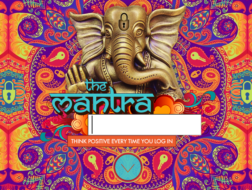
However, some more creative websites have their logo smack in the middle, where the eye naturally lands whenever you open a new website. The Mantra Password website (what a great idea, btw!) does that really well. The colorful background isn’t even distracting–it suits the website perfectly.
Great logos are instantly memorable and should be an integral part of your branding. Identify yourself right away with your logo in the right place on your website.
2. Headline
Ah, the famous headline. They’re so hard to come up with. They must be concise and to the point but express a lot of things:
- Who you are
- What you do
- Why people should care
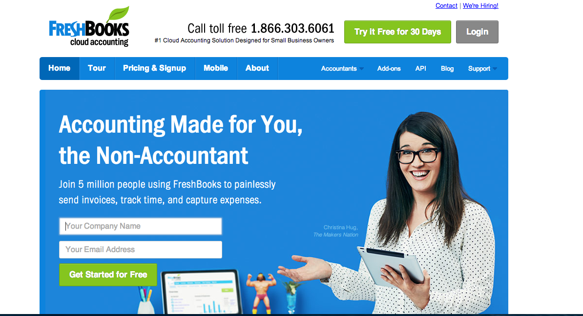
I love the Freshbooks headline because it encapsulates the essence of the system: easy to use, friendly, affordable.
Another great example to be inspired by is Evernote.

Who doesn’t want to remember everything? With these two simple words, Evernote describes its function (remembering) and why you should care (because you want to remember everything). The concept of notetaking is part of their company name, so you have everything you need to know in 3 words.
Great taglines require lots of work. Most people find it hard to compress all their ideas and values in a few simple words. But it’s a worthy exercise, because a great tagline is just as memorable as a great logo.
3. Visuals
Homepages tend to be heavy on the visuals and light on text, and there’s a good reason for that. Remember what I told you about people bouncing away within 5 seconds? Visuals help to retain attention because they’re analyzed by the brain much faster than text.
Having lived in Edmonton for a short 10 months, I can still attest to the amazing amount of festivals and events in the city, even in the chilling cold of winter. The Explore Edmonton website does a great job at using tile-style visuals to express all the fun things you can do, all year long.
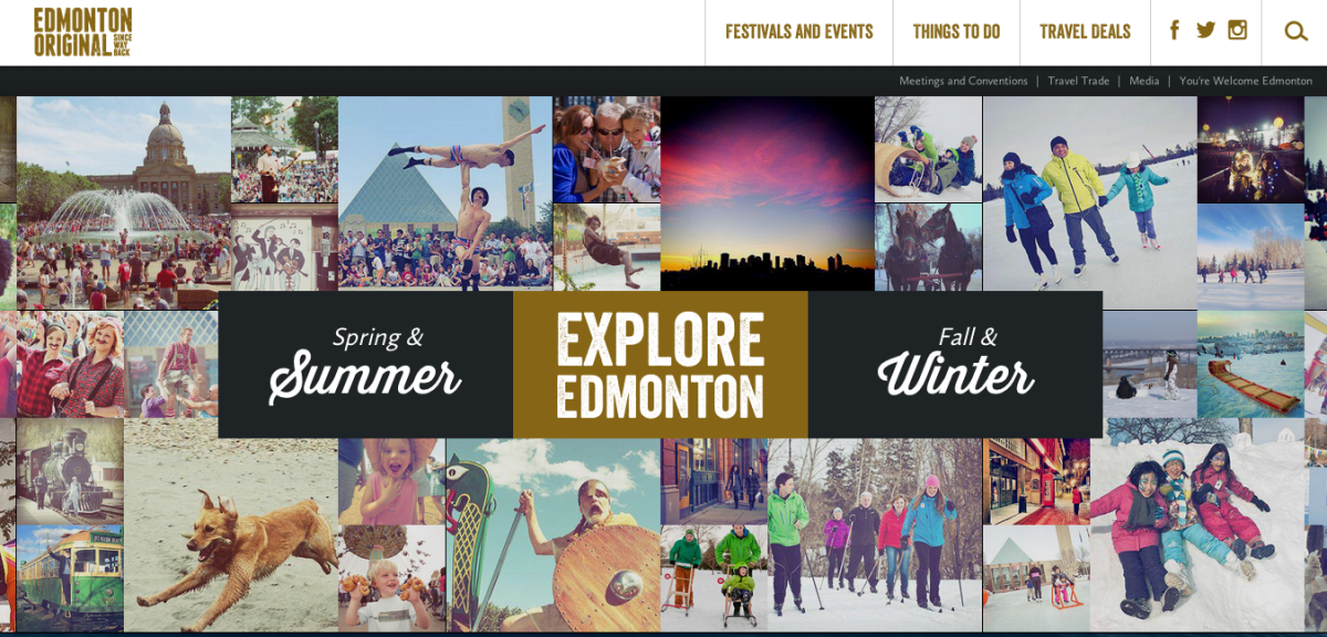
When you hover over “Spring and Summer” or “Fall and Winter”, a single image slides over the tiles. Smart!
Have you ever heard the saying “Go big or go home”? Designzillas, a Florida web design agency, does just that.
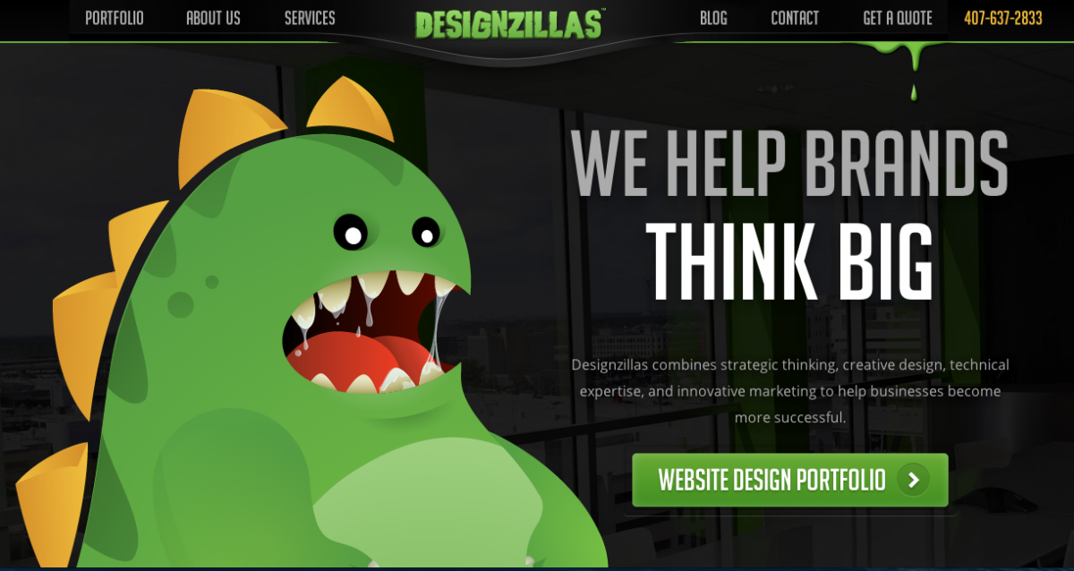
Great illustration with a lot of humour means instant attention.
4. Call to action
You homepage is kind of useless if it doesn’t prompt visitors to take some kind of action: contacting you, downloading a program or joining a mailing list. The best calls to action are clear, highly visible and engaged with your visitors’ emotions.
The Teamwork homepage uses the desire for better productivity to entice people to sign up:
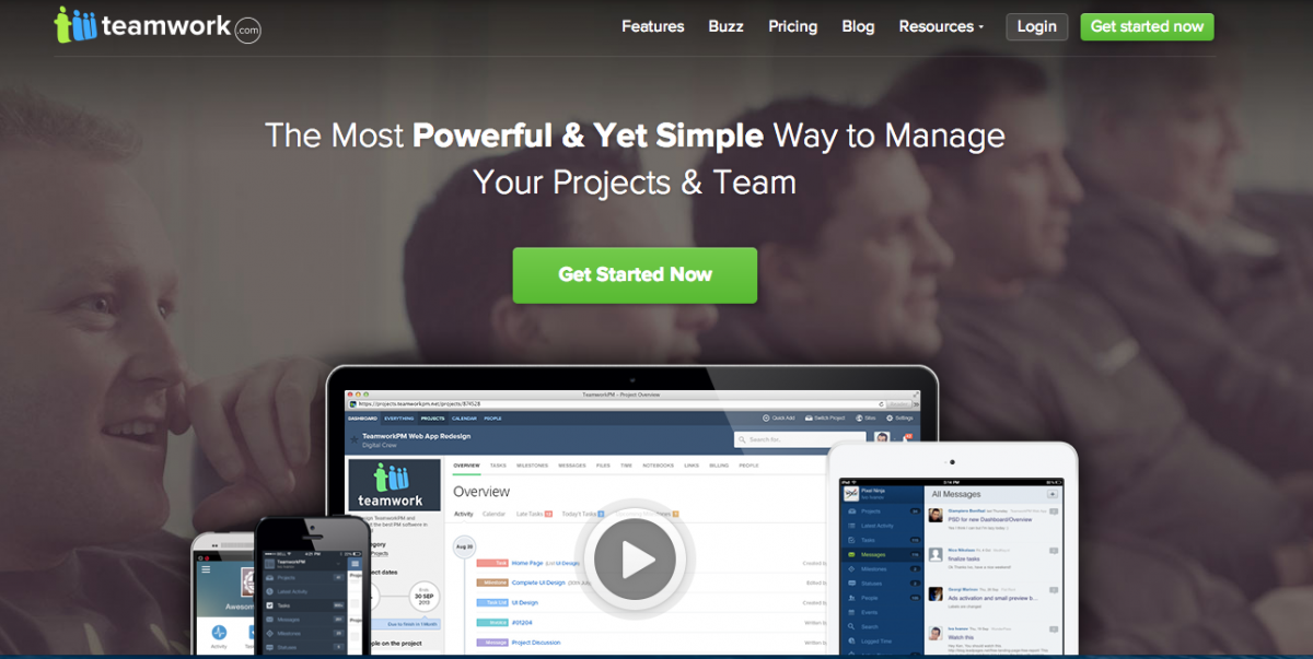
Of course you want to get started now if the product promises easy but powerful project management!
This first section of the homepage is super simple: headline, call to action, visual (in this case a video). If you can’t convince visitors to stay with these three elements, no amount of additional text will help. You’re only going to scroll down if the first “above the fold” section catches your attention–then you can use longer text to further explain the value of your product or service.
For a product that’s not quite ready yet, Liberio is doing great work enticing people to sign up.
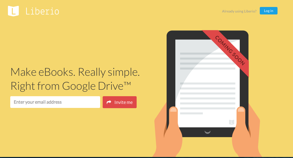
I like how they personalized the call to action–“Invite me” instead of “Get an invitation”. It’s easier to relate to the product if we are personally invested in it. The call to action is short, active, and puts the onus on Liberio to follow up with the invitation.
5. Navigation
I mention this last because your navigation will only matter if visitors stick around your website. But if they do, you have to give them clear and easy directions as to what to do next.
Let’s go back to the Paypal website.

There are 4 elements to the navigation: Buy, Sell, Send, and Business. This is pretty much what Paypal does. Why make it more complicated than that? It’s easy to follow, simple to navigate, and each option brings you to relevant information.
Here’s another great example of clear navigation: World Baking Day.
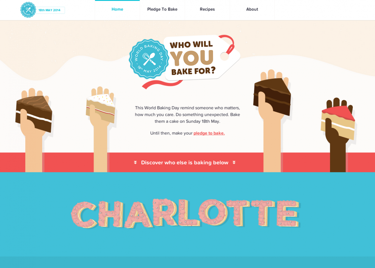
3 navigational choices bring you to the stuff you want to know or do: taking a pledge, browsing recipes, or learning more about World Baking Day.
Not all companies and organizations can limit themselves to 3 or 4 main navigational options, but everyone should strive to simplify as much as possible so navigation is clear and intuitive for users. (That’s why you do user experience testing on websites!)
The perfect homepage
Of course, we could break down most homepages even more, but only the first impression above the fold really matters for hooking visitors. Once that’s done, though, there’s still work to do: taking them through a clear buyer journey, providing helpful information and building trust. But that’s stuff for yet another blog post.
What are your favourite homepages? Which ones do you like for their visuals, clear call to action or awesome headline? Share your finds in the comments!


