There are many components that go into User Experience — it is basically everything about the website that affects how a user feels about the experience of interacting with it.
While we’ve addressed the frustration caused by slow-loading websites in last month’s blog, having buttons and links that don’t work or elements that jump around as the site is loading is just as irritating for visitors.
There are other obvious, but more subtle aspects of the website that can have a devastating effect on the user’s perception. These include a navigation system that isn’t intuitive, text that is hard to read, or a colour palette that feels depressing. These impact perception either consciously or subconsciously. If these are not addressed, this can have a devastating effect on your bottom line.
Last month, we took a look at site load speed and how that affects User Experience. We explained why User Experience should be a Q1 2022 priority for your team, including the fact that 83% of customers say that the experience a company provides is as important as its products or services. In this post we look at some of the most important on-page aspects that play a role in providing a stellar experience for your visitors.
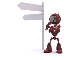
1. Is Your Navigation Confusing?
Without good navigation the visitor to your site will simply not be able to use your site effectively. Their journey through your site and finding the information or products they are looking for will be hampered and they may give up in frustration.

With good navigation a visitor will always be able to locate themselves in the structure of the website. Good website navigation is like the map with a red “you are here” marker you’ll find in large malls. From that map you clearly see where you are in the mall and can see how to get to the store you want to visit.
Website navigation needs to be just as clear; it is not only more productive for the visitor, it creates a feeling of security and empowerment. Nobody likes being lost in the maze of a mall — it’s the same with a website. More than three clicks to any page threatens to frustrate and confuse the user. Designing clear and intuitive menus becomes more complicated the larger the site, but it is still possible.
There are many navigation design patterns to choose from depending on the size of your site and type of business. In any case, navigation starts with a clear menu structure and accurate, precise, consistent labels. When designing your navigation flow make sure it is aligned with your user’s needs and goals. Can your customers quickly find the product they want? Is the information they need easily found and up-to-date?
Travel through your whole sales funnel and see it from your customer’s perspective. Use resources such as the goals in Google Analytics to see where people are bouncing in the sales funnel and determine why. However you do it, to make sure it’s a great user experience, find the awkward points and fix them.
Menus are, of course, very important and there are a large number of menu designs from hamburger to drop down to mega menus, along with various placements. But beyond menus, any of the elements that are used to create a flow through your site counts as navigation, including search, call-to-action buttons, breadcrumbs and internal links to name a few. All contribute to how people navigate through your site, and all need to be considered to determine if or how they add to the ease-of-use, and productivity of the site from the user’s perspective.

VS

For example, we overhauled the site architecture, logo and messaging of the FutureBook Yearbooks website to enable an easy, flowing journey throughout the site. In addition to a pleasant colour palette, the purpose of the site is clear from the start with a prominent “Request A Quote” call-to-action in the header area as well as the home banner area. And the refresh looks clean and modern, bringing us to the next point.
2. Does Your Site Have an Outdated Look and Feel?
There’s an old saying, “a brand takes years to build and 5 minutes to destroy.”
An outdated design sends a negative message to your customers. It makes you look out-of-touch, tired and like you just don’t care — not about your products, your business or your customers either. You may have products or services that are at the forefront of innovation, but if your website looks outdated it will taint the perspective your customers will have of your brand, undoing potentially years of hard work you’ve spent building it.
Some obvious examples could be an old logo, ugly font, old style (remember left sided navigation?), poor quality images, or a host of other design details.
Your website should make you proud and mirror your business values. People gravitate to a space that has positive energy — the sense that something good is going on, whether that something is great products, interesting and useful information or great service.
Your customers will gravitate to something that makes them feel good and doesn’t look straight out of 1997.
3. Is Your Website’s Design Cluttered?

You may be tempted to fill up every little bit of your web page with information or images or animation, but this is a mistake.
Think of your webpage like you would a room in your home. If every corner is filled with stuff, and shelves and closets and drawers are crammed to overflowing, it becomes impossible to find anything. The general feeling is one of messiness and a lack of attention to clear thinking.
A cluttered website design overwhelms the user and impedes their ability to find what they are looking for quickly and easily. In contrast, a clean design gives your visitor a chance to explore and find what they need easily.
Here are a few tips to decluttering your website.
Use white space intelligently
Good design is often simple, using a judicious number of elements surrounded by plenty of white space. “White” space can be any colour, this is a design term that just means the neutral space around and between elements. White space doesn’t mean that elements can’t overlap — see the image of PictureThis3D below, but it let’s the elements breathe and directs attention to what is important — think of Call-to-Action buttons, or a well placed value proposition.

Facilitate scanning
As well, it is important to know that people generally scan a page before deciding if they want to read more in-depth. Good design facilitates scanning, using headings and images to break up text.
4. Do All the Elements Work as Expected across Devices?
A good user experience is predictable and easy. All the elements on the page that a user interacts with, such as links, buttons, forms, carts and checkouts must be as simple as possible and work consistently and reliably. Broken links need to be fixed. The call to action should correspond with what happens if you click the button or link. It’s also worth asking, do you really need all those fields in the contact form?
To preview the mobile experience using the Chrome browser simply click the 3 dots at the top right of a page, go to More Tools then Developer tools. You’ll be able to select any mobile device to see how the page appears.
This extends to how your website is displayed on various devices. Is your website mobile-friendly? Can the buttons be easily clicked? Is the text legible? Do you need to scroll left to right to see everything on the screen? With the major search engines prioritizing the mobile user experience, this is critical to test.
5. Is it Easy to Understand What You Do?
Have you ever gone to a website and been excited to do business with a company, but when you tried to buy from them you couldn’t figure out how? Or, you could see the shop but the link was broken? Then when you wanted to call them, their phone number went straight to a recording?
There’s nothing in e-commerce we find more frustrating than any of those scenarios of bad user experience.
Assume every page is an entry point your visitor has come to your website for a reason.
Perhaps your visitor came in through Google and wants to read your latest blog. Maybe they are researching and comparing your company vs your competition. Or, maybe they’re ready to buy. Regardless of where your visitor is in the funnel it’s incredibly important that they have a good experience at a fundamental level. Make sure your links work. Make sure it’s easy to find information.
Ultimately, your visitor wants to solve their problem, whether that is buying a new car, finding out what time your business is open until – or anything in between. They don’t want to waste time trying to figure out what the website they’ve landed on is about or how to do business with you.
Make sure there’s a clear purpose to the site
The first requirement for providing value is to make sure it is immediately apparent what the site’s purpose is. If your business sells used cars and the person landing on your site doesn’t understand this immediately — your user experience is not good enough.
In the case of our client’s site (below) which we redesigned, it’s clear that they sell cars, they’re the top used car dealership in Victoria, their customers enjoy working with them and it’s easy to contact them.

Use prominent and consistent branding
It should also be immediately apparent who is presenting the site. The brand name and logo must be prominent and it must be easy to do business. The brand values and colours should be integrated into the design of the site, and consistent throughout. This will also help situate the user in the architecture of the site, as mentioned above, providing a sense of security. For Howie’s Car Corral the yellow, red and black colours are consistent and support the brand.
Include a clear value proposition
A value proposition establishes why the visitor should do business with you and not your competition. Don’t make your visitors try to guess how you are going to help them and how you are different from your competitors. Just say it, clearly and succinctly, on the home page and near the top of the page. Howie’s has the BBB image, their contact information and a link to the vehicle inventory – along with having the inventory on the home page just below what we can see.
Deliver what you promise
Of course, you must also deliver on that promise. If a visitor can’t get the information or products they need to fix their problem, they will go elsewhere.
Maybe your business just doesn’t provide what they need.
In that case, if the interaction with the site was good – meaning they realized that fact quickly and easily, there’s no harm.
But if your business actually does provide something that would have benefited that user, but your site didn’t make the visitor aware of this — either because the information wasn’t on the site or because it was too hard to fine, you’ve potentially just lost a customer. And that would be a shame.
Positive User Experience is About Making Your Visitors Feel Happy they Visited
It really is about being a good host and taking into consideration what your visitors need and what will make them happy. You know they are coming to your site for a reason. Are you making it easy for them to find what they need in the friendliest and easiest way possible? That is the goal of a good website user experience.
Of course, a positive user experience is a broad issue with many moving parts. If you’re feeling overwhelmed and don’t even know where to start, we’re here to help.